The imprint mark
The Colophon.
Every publisher's mark is a promise held in a small circle of ink. This one carries five.
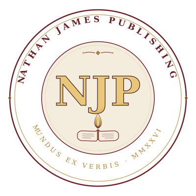
The Colophon of Clairignis. Nathan James Publishing LLC. Woven with the words, the fire, the vessel, the year, and the point of ignition.
At every scale
The same seal, sixty-four to four hundred.
The mark is designed to hold together at any size — from a browser tab favicon to a book’s copyright-page stamp to a full-plate hero display.

The four variants
Every use has its version.
Four sanctioned variants of the mark. Never modify these individually — if a new application needs its own treatment, request a new variant so the family stays coherent.
Primary
The Color Seal
Burgundy, gold, cream, ink. Used everywhere unless a specific application requires otherwise. This is the imprint’s canonical face.
Download SVG ↓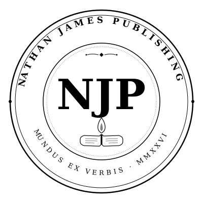
Merch / print
The Monochrome Seal
Single-color rendering for one-color print, embossing, embroidery, foiling, and dark-mode contexts. Inherits currentColor — drop it anywhere and it takes the parent color.
Small scale
The Favicon Seal
Simplified geometry for sub-64px use. Drops the perimeter text (illegible at that size) and preserves the medallion + monogram + flame silhouette.
Download SVG ↓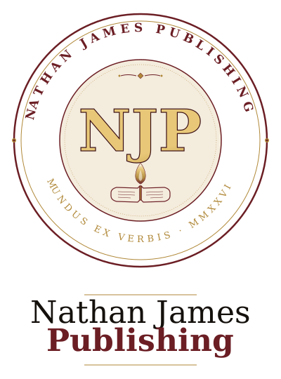
Letterhead / hero
The Full Lockup
Seal plus “Nathan James Publishing” wordmark below in editorial serif. Use for letterhead, formal correspondence, book back covers, or hero placements where the full name should read alongside the mark.
Download SVG ↓Five layers
What’s buried in the mark.
Most publishers’ colophons carry a single meaning — a dolphin, a bird, a monogram. This one carries five, stacked. Some readers see one. A few see three. A very few see them all.
Mundus ex Verbis.
The Latin motto on the bottom arc: “A world from words.”
Surface: an elegant publisher’s motto. Standard-issue print-house energy.
Buried: the dedication. From the song “To The Kid” — “I wish I could give you the world, but instead, I’ll give you these words.” This publisher exists to render that gift.
Reading depth
- Casual observer: “Elegant Latin motto. Very publisher-y.”
- C.U.L.T. reader: “That’s the philosophy — you build your world from what you take in.”
- Knows the dedication: “That’s To The Kid. He gave her the world.”
The Clairignis at the Center.
The stylized flame between the open book and the NJP monogram is Clairignis — French clair (clear) + Latin ignis (fire). Nathan’s own coined word for the combustion of clarity.
Surface: an ornamental flourish.
Buried: “That holy combustion. That wildfire of knowing. That moment the mind don’t just shift — it erupts.” Every book NJP publishes carries this hope. The flame sits between book and monogram because the imprint is the vehicle for the ignition. The gradient runs from cream at the tip (the clair) through gold to burgundy at the base (the ignis). The word is drawn.
Reading depth
- Casual observer: “Pretty decorative flourish.”
- Book reader: “That looks like a candle flame. Fitting for a book publisher.”
- Knows Clairignis: “That IS Clairignis. His word is in the mark.”
The Vessel at the Base.
An open book sits at the bottom of the medallion, pages splayed, spine gold.
Surface: a book on a publisher’s mark. Of course.
Buried: the flame rises from the book. The reading of words produces the ignition. Vertical stack encodes causality: book → flame → mind. Without the book at the base, the flame has nothing to burn from. The book’s spine is drawn in the same gold as the monogram — the imprint IS the spine.
MMXXVI — Time as Roman Numeral.
The founding year appears as MMXXVI on the bottom arc.
Surface: elegant traditional dating.
Buried: the seal reads as if it could be from any era. Designed to outlast its founding moment. Also honors Nathan’s coined-language instinct — the same one that produced Clairignis. Latin motto + French/Latin coined word + Roman numeral date = the seal has a mother tongue.
The Monogram at the Point of Ignition.
The NJP monogram sits at the exact center of the seal, directly above the flame.
Surface: standard publisher branding.
Buried: Nathan James Publishing places itself at the point of Clairignis — not the source of the fire (the reader), not the vessel (the book), but the exact moment of ignition. The italic serif slants forward, walking toward the reader. Roman would have stood still.
Design specifications
The anatomy.
For tweaking, extension, or building future variants. Change these values in the SVG source at /assets/logo/njp_publisher_seal_color.svg.
| Element | Value | Notes |
|---|---|---|
| Canvas / viewBox | 400 × 400 | Square; the seal is round inside |
| Outer ring radius | 180 / 170 | Two concentric rings (burgundy + gold) |
| Inner medallion radius | 115 | Where the monogram + flame + book live |
| Burgundy | #6B1E24 | Outer ring, monogram stroke, book stroke |
| Gold base | #B08838 | Motto text, book spine, decorative dots |
| Gold bright | #E8C878 | Monogram top gradient |
| Gold deep | #7A5A20 | Monogram bottom gradient |
| Paper cream | #F4ECDD | Inner medallion fill, flame tip |
| Top arc text | NATHAN JAMES PUBLISHING | Georgia 17px bold, letter-spacing 6, burgundy |
| Bottom arc text | MUNDUS EX VERBIS · MMXXVI | Georgia 13px italic, letter-spacing 5, gold |
| Monogram | NJP | Georgia 82px italic bold, gold gradient, burgundy stroke 1.2px |
| Flame height | ~18px | Between book (y=278) and monogram (y=215) |
| Book width | ~84px | At y=278, gold spine matches monogram gradient |
Iteration notes
What to tweak, and how.
Common iteration paths
- Flame proportions. Adjust the
d="M 0,-18 Q -6,-10..."path inside<g transform="translate(200, 250)">. Increase the -18 (taller flame) or the ±7 offsets (wider). Also update the mono + favicon variants to match. - Monogram weight. Change
font-size="82"on the NJP text element. Anything below 70 loses gravitas; anything above 90 crowds the flame. - Ring thickness. Outer
stroke-width="2.5"and innerstroke-width="1". Bump both by 0.5 for a heavier feel; drop both by 0.5 for lighter. - Motto wording. Change the
textPathcontent in the bottom arc. Any change should stay Latin or Latin-derived to preserve the mother-tongue integrity of the mark. - Color story. To shift the palette (e.g., toward a Nyasia-associated color for a variant seal), change the gradient stops in
#njp-gold. The burgundy is load-bearing on the outer ring — don’t change it without a plan. - Adding a new variant. Duplicate
njp_publisher_seal_color.svg, change what you need, save asnjp_publisher_seal_[name].svgin the same folder. Register it here on this page so it doesn’t get orphaned.
The colophon is the promise, in a small circle of ink.
Every time it appears — on a book, on a page, on a shelf, on a tab — it carries all five meanings simultaneously.
Return home →